Buried in the Toronto Economic Bulletin (warning: Excel document) is a column listing the number of passengers passing through Pearson International Airport (YYZ) each month, going back more than fifteen years. There’s a story to tell in the forecast, too:
Flight data are a great forecasting example because they display such clear
seasonal patterns, in this case peaking in the summer months and falling off in
the winter. R has excellent tools for working with time series data and whipping
up simple forecasts like this one. But there’s some friction with the modern
tidyverse tools, because the latter expect a data.frame as the common
interchange format.
In this post, I’ll outline an approach to fitting many time series models using the tidyverse tools, including model selection for out-of-sample performance. To ease the transition between these two worlds I make extensive use of list columns and the broom package.
The Set Up
For this post I’ve extracted the data into a vector of R’s built-in ts class,
which is the common interchange format for most time series packages. As of
writing, I have data from January 2000 through August 2016.
# load("path/to/passengers.rda")
str(passengers)
## Time-Series [1:200] from 2000 to 2017: 2072798 2118150 2384907 2260620 2386165 2635018 2788843 2942082 2477000 2527969 ...
You’ll also need the following packages, all of which are staples of the tidyverse except for forecast, which is a prominent time series forecasting package for R:
suppressMessages({
    library(dplyr)
    library(tidyr)
    library(purrr)
    library(broom)
    library(ggplot2)
    library(forecast)
})
Time Series Forecasting in R
There are an overwhelming number of time series models used for forecasting out there (see the CRAN task view on time series for a sense of what’s available in R alone), but the most common ones are probably ARIMA and ETS, both of which can handle seasonal data sets like this one.
In choosing a model for forecasting, what we care about is the accuracy of the model on unseen (that is, out-of-sample) data. Since we don’t have a way of measuring that directly, we simulate the experience by holding out a test set.
The nature of the autocorrelated errors in time series data mean that randomly selecting training and test sets (or, indeed, using traditional bootstrap or cross-validation) will erase much of the information in the data, so common practice with time series data is to hold out the last few observations, ideally the same interval as you’d like to forecast over.1
I’ll mention that this risks overfitting to this particular test set, something I’ll return to below. (As the statistician Andrew Gelman has remarked, it is important to realise that test sets and cross validation are estimates of out-of-sample performance, not a direct measure.)
For this post I’m going to hold out the two most recent years' worth of data as
a test set. R provides a convenient window function for breaking up time
series:
train <- window(passengers, end = c(2014, 8))
test <- window(passengers, start = c(2014, 9))
We can use this training set to fit some ARIMA and ETS models, and see how they compare.
Fitting ARIMA Models in R
R has built in support for fitting ARIMA models with, you guessed it, the
arima() function. However, there are a number of shortcomings to this
implementation, so I’d recommend using the Arima() version from the
forecast package instead. You can also try your luck with the package’s
auto.arima() function, which will try and find an optimal model automatically.
Choosing the order of an ARIMA model usually benefits from some manual
exploration of the autocorrelated errors, especially using the
forecast::tsdisplay() plot. For brevity I won’t walk you through the process
here, but I’d strongly recommend taking a look at Rob Hyndman and George
Athanasopoulos' chapter on forecasting seasonal data using ARIMA,
which is freely available online.
For now, auto.arima() should do just fine. It’s worth experimenting with the
approximations disabled, as follows:
arima.fit <- forecast::auto.arima(train, d = 1, D = 1,
                                  stepwise = FALSE,
                                  approximation = FALSE)
arima.fit
## Series: train
## ARIMA(0,1,1)(0,1,1)[12]
##
## Coefficients:
##           ma1     sma1
##       -0.1927  -0.6731
## s.e.   0.0774   0.0675
##
## sigma^2 estimated as 6.925e+09:  log likelihood=-2080.57
## AIC=4167.15   AICc=4167.3   BIC=4176.43
The automatic process selects an ARIMA model with low order, indicating that a simple model might fit this data reasonably well.
Fitting ETS Models in R
The forecast package also provides an ets function, which by default will
choose an optimal model:
ets.fit <- forecast::ets(train, model = "ZZZ")
ets.fit
## ETS(A,N,A)
##
## Call:
##  forecast::ets(y = train, model = "ZZZ")
##
##   Smoothing parameters:
##     alpha = 0.7467
##     gamma = 1e-04
##
##   Initial states:
##     l = 2373863.6415
##     s=-155048.7 -371915.5 -66744.27 -9469.378 562836.6 411528.9
##            104613.3 -2894.734 -101326.8 65840.67 -269851.6 -167568.5
##
##   sigma:  79047.8
##
##      AIC     AICc      BIC
## 4909.794 4912.794 4957.351
Notice that this (ostensibly optimal) model has an AICc of 4912.794, which is much higher than the ARIMA models explored above. This may be an indication that ETS models are not a good fit for this data set.
Fitting Many Models using List-Columns and Purrr
One can choose both an ARIMA and ETS model based on how well it fits the training data. However, when forecasting, better out-of-sample performance is the true goal. For this reason, I’m going to take a more systematic approach, fitting a wide variety of both ETS and ARIMA models and comparing their out-of-sample performance.
Inspired by the general coherence of the tidyverse, I believe all of this can be organized into a tidy data frame, with one model per row. I use the following approach:
- Create columns for training data, modelling functions, and any other model parameters.
- Wrap these training data and model parameters into a single
paramcolumn. - Use
purrr::invoke_map()to apply the modelling function to these model parameters; and - Use
purrr::map()and friends (orbroom::glance()) to extract goodness of fit measures.
To start with, we create data sets of models and their parameters. The following
will generate a data frame of all possible ETS models (check out ?ets for
details):
ets.params <- tidyr::crossing(
    error = c("A", "M"), trend = c("N", "A", "M"),
    seasonal = c("N", "A", "M"), damped = c(TRUE, FALSE)
) %>%
    # Drop combinations with a damped non-trend.
    mutate(drop = ifelse(trend == "N" & damped, TRUE, FALSE)) %>%
    filter(!drop) %>%
    # Create labels for the models out of these parameters.
    mutate(kind = "ETS",
           desc = paste0("(", error, ",", trend,
                         ifelse(damped, "d", ""),
                         ",", seasonal, ")"),
           model = paste0(error, trend, seasonal)) %>%
    # Drop nonsensical models (these are flagged by `ets` anyway).
    filter(!model %in% c("MMA", "AMN", "AMA", "AMM",
                         "ANM", "AAM")) %>%
    select(kind, desc, model, damped)

ets.params
## # A tibble: 19 × 4
##     kind     desc model damped
##    <chr>    <chr> <chr>  <lgl>
## 1    ETS  (A,A,A)   AAA  FALSE
## 2    ETS (A,Ad,A)   AAA   TRUE
## 3    ETS  (A,A,N)   AAN  FALSE
## 4    ETS (A,Ad,N)   AAN   TRUE
## 5    ETS  (A,N,A)   ANA  FALSE
## 6    ETS  (A,N,N)   ANN  FALSE
## 7    ETS  (M,A,A)   MAA  FALSE
## 8    ETS (M,Ad,A)   MAA   TRUE
## 9    ETS  (M,A,M)   MAM  FALSE
## 10   ETS (M,Ad,M)   MAM   TRUE
## 11   ETS  (M,A,N)   MAN  FALSE
## 12   ETS (M,Ad,N)   MAN   TRUE
## 13   ETS  (M,M,M)   MMM  FALSE
## 14   ETS (M,Md,M)   MMM   TRUE
## 15   ETS  (M,M,N)   MMN  FALSE
## 16   ETS (M,Md,N)   MMN   TRUE
## 17   ETS  (M,N,A)   MNA  FALSE
## 18   ETS  (M,N,M)   MNM  FALSE
## 19   ETS  (M,N,N)   MNN  FALSE
With this set of model parameters in hand, we can create list columns containing
the training data and the function to compute the model (ets in this case). We
can also wrap up the parameters into a param list column by using the curious
but useful transpose() function.
ets.models <- ets.params %>%
    # Add in the training set and the modelling function.
    mutate(fn = replicate(forecast::ets, n = n()),
           train = replicate(list(train), n = n())) %>%
    # Create a "param" column to pass to `fn`.
    mutate(params = purrr::transpose(list(
        "y" = train, "model" = model, "damped" = damped
    ))) %>%
    select(kind, desc, train, fn, params)

ets.models
## # A tibble: 19 × 5
##     kind     desc    train     fn     params
##    <chr>    <chr>   <list> <list>     <list>
## 1    ETS  (A,A,A) <S3: ts>  <fun> <list [3]>
## 2    ETS (A,Ad,A) <S3: ts>  <fun> <list [3]>
## 3    ETS  (A,A,N) <S3: ts>  <fun> <list [3]>
## 4    ETS (A,Ad,N) <S3: ts>  <fun> <list [3]>
## 5    ETS  (A,N,A) <S3: ts>  <fun> <list [3]>
## 6    ETS  (A,N,N) <S3: ts>  <fun> <list [3]>
## 7    ETS  (M,A,A) <S3: ts>  <fun> <list [3]>
## 8    ETS (M,Ad,A) <S3: ts>  <fun> <list [3]>
## 9    ETS  (M,A,M) <S3: ts>  <fun> <list [3]>
## 10   ETS (M,Ad,M) <S3: ts>  <fun> <list [3]>
## 11   ETS  (M,A,N) <S3: ts>  <fun> <list [3]>
## 12   ETS (M,Ad,N) <S3: ts>  <fun> <list [3]>
## 13   ETS  (M,M,M) <S3: ts>  <fun> <list [3]>
## 14   ETS (M,Md,M) <S3: ts>  <fun> <list [3]>
## 15   ETS  (M,M,N) <S3: ts>  <fun> <list [3]>
## 16   ETS (M,Md,N) <S3: ts>  <fun> <list [3]>
## 17   ETS  (M,N,A) <S3: ts>  <fun> <list [3]>
## 18   ETS  (M,N,M) <S3: ts>  <fun> <list [3]>
## 19   ETS  (M,N,N) <S3: ts>  <fun> <list [3]>
And now we can make use of invoke_map() to fit all of these models. I’ve also
extracted the AICc values of each for comparison.
ets.fits <- ets.models %>%
    # Fit the models, and extract the AICc.
    mutate(fit = purrr::invoke_map(fn, params),
           aicc = purrr::map_dbl(fit, "aicc")) %>%
    arrange(aicc)

ets.fits
## # A tibble: 19 × 7
##     kind     desc    train     fn     params       fit     aicc
##    <chr>    <chr>   <list> <list>     <list>    <list>    <dbl>
## 1    ETS  (A,N,A) <S3: ts>  <fun> <list [3]> <S3: ets> 4912.794
## 2    ETS  (M,N,M) <S3: ts>  <fun> <list [3]> <S3: ets> 4914.492
## 3    ETS  (A,A,A) <S3: ts>  <fun> <list [3]> <S3: ets> 4923.181
## 4    ETS (A,Ad,A) <S3: ts>  <fun> <list [3]> <S3: ets> 4925.173
## 5    ETS (M,Ad,M) <S3: ts>  <fun> <list [3]> <S3: ets> 4925.813
## 6    ETS (M,Md,M) <S3: ts>  <fun> <list [3]> <S3: ets> 4926.635
## 7    ETS  (M,N,A) <S3: ts>  <fun> <list [3]> <S3: ets> 4928.246
## 8    ETS (M,Ad,A) <S3: ts>  <fun> <list [3]> <S3: ets> 4941.445
## 9    ETS  (M,A,A) <S3: ts>  <fun> <list [3]> <S3: ets> 4942.699
## 10   ETS  (M,A,M) <S3: ts>  <fun> <list [3]> <S3: ets> 4977.796
## 11   ETS  (M,M,M) <S3: ts>  <fun> <list [3]> <S3: ets> 4985.782
## 12   ETS  (M,M,N) <S3: ts>  <fun> <list [3]> <S3: ets> 5283.217
## 13   ETS  (M,N,N) <S3: ts>  <fun> <list [3]> <S3: ets> 5283.227
## 14   ETS  (M,A,N) <S3: ts>  <fun> <list [3]> <S3: ets> 5285.426
## 15   ETS (M,Ad,N) <S3: ts>  <fun> <list [3]> <S3: ets> 5285.783
## 16   ETS (M,Md,N) <S3: ts>  <fun> <list [3]> <S3: ets> 5286.098
## 17   ETS  (A,N,N) <S3: ts>  <fun> <list [3]> <S3: ets> 5301.575
## 18   ETS (A,Ad,N) <S3: ts>  <fun> <list [3]> <S3: ets> 5305.353
## 19   ETS  (A,A,N) <S3: ts>  <fun> <list [3]> <S3: ets> 5308.133
Note that the best-performing model here — ETS(A,N,A) — is the same one
arrived at automatically above.
We can do the same thing with the ARIMA models: generate a list of model
parameters as a data frame, collect these into a param list-column, and then
fit the function using invoke_map(). Unlike ETS, there are an infinite number
of possible ARIMA models. However, we can guess from above that good models will
have low order.
arima.params <- tidyr::crossing(ar = 0:2, d = 1:2, ma = 0:2,
                                sar = 0:1, sma = 0:1) %>%
    # Create a label for the model.
    mutate(kind = "ARIMA",
           desc = paste0("(", ar, ",", d, ",", ma, ")(",
                         sar, ",1,", sma, ")")) %>%
    group_by(kind, desc) %>%
    # This has to be done rowwise to avoid the flattening
    # behaviour of c().
    do(order = c(.$ar, .$d, .$ma),
       seasonal = c(.$sar, 1, .$sma)) %>%
    ungroup()

arima.models <- arima.params %>%
    # Add in the training set and the modelling function.
    mutate(fn = replicate(forecast::Arima, n = n()),
           train = replicate(list(train), n = n())) %>%
    # Create a "param" column to pass to `fn`.
    mutate(params = purrr::transpose(list(
        "y" = train, "order" = order, "seasonal" = seasonal
    ))) %>%
    select(kind, desc, train, fn, params)

arima.fits <- arima.models %>%
    # Fit the models, and extract the AICc.
    mutate(fit = purrr::invoke_map(fn, params),
           aicc = purrr::map_dbl(fit, "aicc")) %>%
    arrange(aicc)

arima.fits
## # A tibble: 72 × 7
##     kind           desc    train     fn     params         fit     aicc
##    <chr>          <chr>   <list> <list>     <list>      <list>    <dbl>
## 1  ARIMA (0,2,2)(0,1,1) <S3: ts>  <fun> <list [3]> <S3: ARIMA> 4157.528
## 2  ARIMA (1,2,1)(0,1,1) <S3: ts>  <fun> <list [3]> <S3: ARIMA> 4157.796
## 3  ARIMA (0,2,2)(1,1,1) <S3: ts>  <fun> <list [3]> <S3: ARIMA> 4158.203
## 4  ARIMA (1,2,1)(1,1,1) <S3: ts>  <fun> <list [3]> <S3: ARIMA> 4158.223
## 5  ARIMA (2,2,1)(0,1,1) <S3: ts>  <fun> <list [3]> <S3: ARIMA> 4159.600
## 6  ARIMA (1,2,2)(0,1,1) <S3: ts>  <fun> <list [3]> <S3: ARIMA> 4159.658
## 7  ARIMA (2,2,1)(1,1,1) <S3: ts>  <fun> <list [3]> <S3: ARIMA> 4160.292
## 8  ARIMA (1,2,2)(1,1,1) <S3: ts>  <fun> <list [3]> <S3: ARIMA> 4160.306
## 9  ARIMA (0,2,1)(0,1,1) <S3: ts>  <fun> <list [3]> <S3: ARIMA> 4160.888
## 10 ARIMA (0,2,1)(1,1,1) <S3: ts>  <fun> <list [3]> <S3: ARIMA> 4161.533
## # ... with 62 more rows
Since this data frame has the same form as the one used for the ETS models, we
can concatenate them into a master list of models. The forecast() function is
its namesake package’s universal forecasting function. We can use it to add a
column of the two-year forecast for all of these models.
yyz.forecasts <- dplyr::bind_rows(ets.fits, arima.fits) %>%
    mutate(forecast = map(fit, forecast::forecast, h = 24)) %>%
    arrange(aicc)

yyz.forecasts
## # A tibble: 91 × 8
##     kind           desc    train     fn     params         fit     aicc
##    <chr>          <chr>   <list> <list>     <list>      <list>    <dbl>
## 1  ARIMA (0,2,2)(0,1,1) <S3: ts>  <fun> <list [3]> <S3: ARIMA> 4157.528
## 2  ARIMA (1,2,1)(0,1,1) <S3: ts>  <fun> <list [3]> <S3: ARIMA> 4157.796
## 3  ARIMA (0,2,2)(1,1,1) <S3: ts>  <fun> <list [3]> <S3: ARIMA> 4158.203
## 4  ARIMA (1,2,1)(1,1,1) <S3: ts>  <fun> <list [3]> <S3: ARIMA> 4158.223
## 5  ARIMA (2,2,1)(0,1,1) <S3: ts>  <fun> <list [3]> <S3: ARIMA> 4159.600
## 6  ARIMA (1,2,2)(0,1,1) <S3: ts>  <fun> <list [3]> <S3: ARIMA> 4159.658
## 7  ARIMA (2,2,1)(1,1,1) <S3: ts>  <fun> <list [3]> <S3: ARIMA> 4160.292
## 8  ARIMA (1,2,2)(1,1,1) <S3: ts>  <fun> <list [3]> <S3: ARIMA> 4160.306
## 9  ARIMA (0,2,1)(0,1,1) <S3: ts>  <fun> <list [3]> <S3: ARIMA> 4160.888
## 10 ARIMA (0,2,1)(1,1,1) <S3: ts>  <fun> <list [3]> <S3: ARIMA> 4161.533
## # ... with 81 more rows, and 1 more variables: forecast <list>
Measuring Forecast Accuracy
The AICc is not a direct measure of forecast accuracy. Traditional root mean
squared error (RMSE) and mean absolute error (MAE) are both options, although
the author of the forecast package recommends mean absolute scaled error
(MASE). The package provides the accuracy() function to compute all of these
measures (and a few others) for any forecast object, but unfortunately it
returns a matrix with meaningful row names, which would be hard to wrap up
inside a list column. What we need is an API that returns a data frame.
It turns out that there is a project
devoted specifically to this problem. The broom package provides a standard
interface for “tidying” model summaries using the S3 glance() method. At the
time of writing, the package doesn’t contain an implementation for forecast
objects, but it isn’t too hard to write one using the output of
forecast::accuracy():
glance.forecast <- function(x, newdata = NULL, ...) {
    res <- if (is.null(newdata)) {
        acc <- forecast::accuracy(x)
        tibble::as_tibble(t(acc[1,]))
    } else {
        acc <- forecast::accuracy(x, newdata)
        tibble::as_tibble(t(acc[2,]))
    }
    # Format the names of the measures to suit broom::glance().
    names(res) <- tolower(names(res))
    if (length(names(res)) > 7) names(res)[8] <- "thielsu"
    res
}
This can now be combined with tidyr::unnest() to get columns of RMSE, MAE, MASE,
and so on using map():
acc <- yyz.forecasts %>%
    mutate(glance = map(forecast, broom::glance)) %>%
    unnest(glance) %>%
    arrange(rmse, mae, mase)

select(acc, kind, desc, rmse, mae, mase)
## # A tibble: 91 × 5
##     kind           desc     rmse      mae      mase
##    <chr>          <chr>    <dbl>    <dbl>     <dbl>
## 1  ARIMA (2,1,2)(1,1,1) 76061.98 51352.61 0.3289412
## 2    ETS        (M,N,M) 76143.55 49990.36 0.3202153
## 3    ETS       (M,Ad,M) 76387.04 50008.08 0.3203288
## 4    ETS       (M,Md,M) 76595.67 50443.22 0.3231161
## 5    ETS        (A,N,A) 79047.80 53876.34 0.3451071
## 6    ETS        (M,N,A) 79174.58 54396.73 0.3484405
## 7  ARIMA (2,2,1)(1,1,1) 79294.88 53378.97 0.3419212
## 8  ARIMA (1,2,2)(1,1,1) 79303.39 53397.52 0.3420400
## 9  ARIMA (1,1,2)(1,1,1) 79305.25 53167.62 0.3405674
## 10 ARIMA (0,2,2)(1,1,1) 79307.55 53368.28 0.3418527
## # ... with 81 more rows
Each accuracy measure provides a slightly different ranking of models. Does this list lay out which model is best? If what you are after is forecast accuracy, the answer is no. It is overwhelmingly likely that some models which perform exceptionally well on this training data may do poorly when confronted with new data. This is precisely why we left a “test” series aside earlier.
Measuring Out-of-Sample Performance Using a Test Set
You might have noticed above that the broom::glance() implementation above
accepts a newdata parameter for out-of-sample accuracy assessment. We can
pass the test data left aside at the start of the post in the same fashion as
above, and lay out the in-sample and out-of-sample measures side by side.
This is also a great opportunity for visual exploration! I’m going to use the
ggrepel package to add cleaner labels to the top in-sample and test-set
performers, although you can also substitute the built-in
ggplot2::geom_label() here.
perf <- yyz.forecasts %>%
    mutate(test = replicate(list(test), n = n()),
           glance = map2(forecast, test, broom::glance)) %>%
    tidyr::unnest(glance) %>%
    # Pull out the out-of-sample RMSE, MAE, and MASE.
    select(kind, desc, oos.rmse = rmse,
           oos.mae = mae, oos.mase = mase) %>%
    # Join the in-sample RMSE, MAE, and MASE columns.
    inner_join(acc, by = c("kind", "desc")) %>%
    rename(is.rmse = rmse, is.mae = mae, is.mase = mase) %>%
    arrange(oos.rmse, is.rmse) %>%
    select(kind, desc, is.rmse, oos.rmse, is.mae, oos.mae,
           is.mase, oos.mase)

# Find the top four models by in-sample and out-of-sample MASE.
top.perf <- perf %>%
    mutate(top.is = rank(is.mase), top.oos = rank(oos.mase)) %>%
    filter(top.is <= 4 | top.oos <= 4)

library(ggrepel)

# Graph in-sample vs. out-of-sample MASE for the top 50% of each.
perf %>%
    filter(oos.mase < quantile(oos.mase, 0.5) |
           is.mase < quantile(is.mase, 0.5)) %>%
    ggplot(aes(y = oos.mase, x = is.mase)) +
    geom_point(aes(colour = kind)) +
    # Vertical/horizontal lines at the minimum MASE for each sample.
    geom_vline(aes(xintercept = min(is.mase)),
               linetype = 5, colour = "gray50") +
    geom_hline(aes(yintercept = min(oos.mase)),
               linetype = 5, colour = "gray50") +
    # Label the top models.
    ggrepel::geom_label_repel(aes(label = paste(kind, desc)),
                             size = 2.5, segment.colour = "gray50",
                             data = top.perf) +
    labs(x = "In-Sample MASE", y = "Out-of-Sample MASE",
         colour = "Family")
This plot reveals some interesting patterns. First, it looks as though some of
the multiplicative ETS models do quite well on measures of in-sample accuracy,
but poorly when confronted with the test set (top left). Second, there is an
ETS (M,M,M) model that does very well on the test set, but quite unremarkably
on the training data (bottom right). To mirror this, the best in-sample
performer has only middling test set performance (middle right). Third, the
models that do well on both measures tend to be ARIMA models of low order
(bottom left).
What conclusions can we draw from this? Test set performance isn’t the ultimate
arbiter of forecasting performance. As I mentioned above, you can overfit to
this specific test set, which is probably what is going on with the high-flying
ETS (M,M,M) model. The low-order ARIMA models strike me as a better choice.
Forecasting, Finally
Okay, now that we’ve settled on a model, it’s time to actually forecast the series forward.
passengers.fc <- passengers %>%
    Arima(order = c(2, 1, 2), seasonal = c(1, 1, 0)) %>%
    forecast(h = 24, level = c(50, 95))
All forecast accuracy measures aside, there’s no substitute for the sense of
model performance one gets by visual inspection. The forecast object has an
implementation for the ggplot2::autoplot() S3 method in addition to the base
graphics plot(), so we can get a ggplot2 graphic very easily. The
autoplot() output doesn’t include the fitted values by default, but we can add
them manually:
autoplot(passengers.fc) +
    geom_path(aes(y = as.vector(passengers.fc$fitted),
                  x = time(passengers.fc$fitted)),
              linetype = 1, alpha = 0.5, colour = "red")
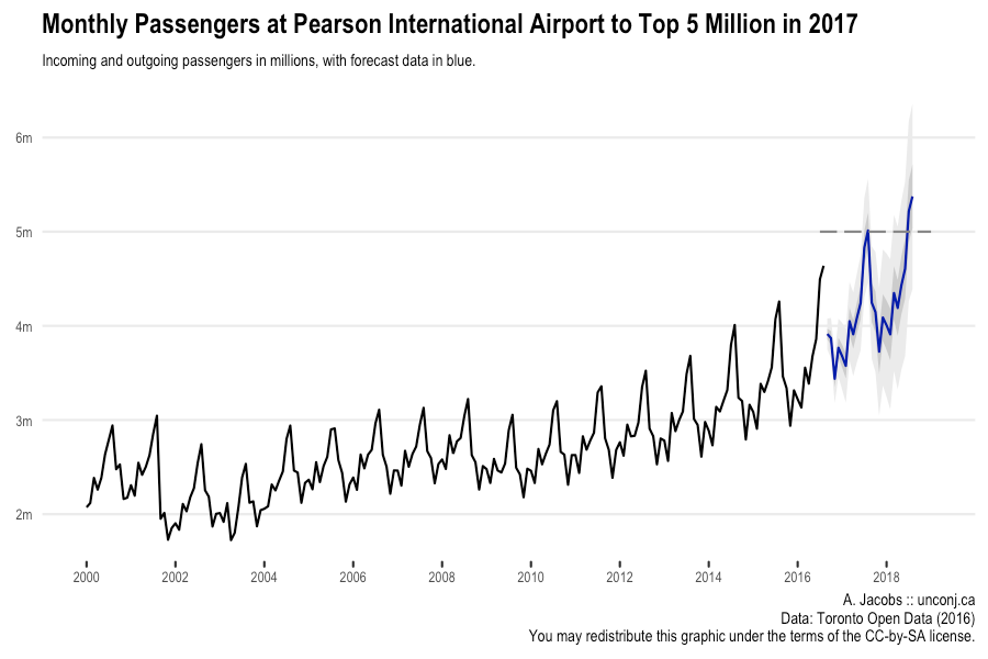
It looks like the model fits the data quite well, aside from some trouble around 2003. The forecast output also gives us a nice story to tell: monthly passengers at YYZ looks likely to break 5 million for the first time in summer 2017.
With this story in hand, you can wrap up the output of autoplot() in a pretty
theme, add some bells and whistles, and publish a nice little graphic on this
data. The code below generates the plot at the top of this post:
millions <- function(x) paste0(format(x / 1e6, digits = 2), "m")

autoplot(passengers.fc, shadecols = c("#cccccc", "#eeeeee")) +
    geom_segment(aes(y = 5e6, yend = 5e6, x = 2016.5, xend = 2019),
                 size = 0.5, colour = "#888888", linetype = 5) +
    scale_x_continuous(breaks = seq(2000, 2018, by = 2), expand = c(0, 1)) +
    scale_y_continuous(labels = millions) +
    theme_minimal() +
    theme(legend.position = "none",
          panel.grid.minor = element_blank(),
          panel.grid.major.x = element_blank(),
          axis.ticks.x = element_line(colour = "#333333", size = 0.5),
          axis.ticks.length = grid::unit(2, units = "pt"),
          text = element_text(family = "Arial Narrow", size = 8),
          plot.title = element_text(size = 12, face = "bold")) +
    labs(title = paste("Monthly Passengers at Pearson International Airport",
                       "to Top 5 Million in 2017"),
         subtitle = paste("Incoming and outgoing passengers in millions,",
                          "with forecast data in blue."),
         caption = paste("A. Jacobs :: unconj.ca\n",
                         "Data: Toronto Open Data (2016)\n",
                         "You may redistribute this graphic under",
                         "the terms of the CC-by-SA license."),
         x = NULL, y = NULL)
## Scale for 'x' is already present. Adding another scale for 'x', which
## will replace the existing scale.
-
The author of the forecast package has recently revealed that future versions of the package will provide support for computing cross validation-like residuals. I may discuss incorporating this function in a future post. ↩︎