Continuing with the theme of my last post, I wanted to put an interesting visualization together using some publically available data. The result is the following (somewhat surprising) graphic:
One of the looming issues in Canadian public policy is how to address the fact that our population is ageing, and that this will mean a larger burden on many of the social services that are more heavily consumed by those who are older. But just how uneven is the consumption of health services? The above should give you some idea of why this is viewed as a looming problem.
The remainder of this post is a technical discussion of how I created the visualization. I’m not quite satisfied with the overall approach (I think it takes quite a while before you can really read the graphic), but it does serve as a good technical demonstration of what can be accomplished in R.
Creating a “Spie” Chart with ggplot2
A spie chart is really just a way of comparing two pie charts. The width of each slice corresponds to its share by one measure, and its area (or, in some formulations, its height, corresponds to its share by another). I originally found the concept while exploring DataVis. A version of the the paper that introduced the concept is available here.
In order to get the Canadian health spending data into a format suitable for
comparison with this chart, we need need to play around with it a bit. CIHI
publishes their complete tables for free here,
but none of it was in precisely the format that I wanted, so I extracted the
relevant information from Table E.1.14 and Appendix C.17 and created the
following pop_exp_canada_2011.csv file to work with:
bin,pop,exp,sex
<1,192.49,1737.42,F
1-4,738.24,1117.42,F
5-9,885.96,1091.74,F
10-14,924.04,1200.01,F
15-19,1072.69,1823.61,F
20-24,1169.13,2345.44,F
25-29,1193.84,3176.77,F
30-34,1174.74,3504.91,F
35-39,1140.41,2994.82,F
40-44,1189.54,2860.62,F
45-49,1364.98,3522.20,F
50-54,1334.70,3963.40,F
55-59,1193.13,4113.49,F
60-64,1040.40,4473.18,F
65-69,790.72,4687.53,F
70-74,603.58,4842.44,F
75-79,503.05,5587.23,F
80-84,410.18,6525.53,F
85-89,283.02,7068.76,F
90+,172.18,4698.45,F
<1,201.30,2055.33,M
1-4,777.30,1251.80,M
5-9,939.64,1253.51,M
10-14,975.94,1303.69,M
15-19,1123.67,1656.40,M
20-24,1235.04,1770.19,M
25-29,1229.32,1853.98,M
30-34,1174.23,1898.48,M
35-39,1147.82,2026.09,M
40-44,1204.91,2454.87,M
45-49,1384.03,3280.49,M
50-54,1332.97,3942.38,M
55-59,1161.09,4361.40,M
60-64,999.08,4889.40,M
65-69,744.85,5187.12,M
70-74,539.84,5026.25,M
75-79,416.40,5207.42,M
80-84,294.40,4821.01,M
85-89,158.38,3526.42,M
90+,66.76,1594.15,M
The first thing to do is reorganize the data. We want the data for women to run in the reverse order, so that Women <1 are next to Men <1. This is purely an aesthetic consideration; you can experiment with the spie chart that is produced when skipping this step.
# Data culled form Appendix C.17 and Table E.1.14 of the CIHI report's data
spie.data <- read.csv("~/Code/R/data/pop_exp_canada_2011.csv", header = TRUE)

# (Optional) Change the levels from "F" and "M" to more complete labels:
levels(spie.data$sex) <- c("Women", "Men")

# Reorganize the data (we can skip the factor column "sex", since it does not
# make a difference):
spie.data$bin[1:20] <- rev(spie.data$bin[1:20])
spie.data$exp[1:20] <- rev(spie.data$exp[1:20])
spie.data$pop[1:20] <- rev(spie.data$pop[1:20])
Now we need to convert the population data into shares (percentages). We also need to compute the cumulative population share so that we can properly position the entries along the x-axis. Finally, we calculate the radius of the expenditure for a given slice of the population using the formula from the original paper:
$$ r_{outer}^2 = \frac{outer_i}{\sum outer_i} \frac{inner_i}{\sum inner_i} $$
Which implies an inner radius of 1. (To understand where this number comes from, remember that the area of a slice of a circle is given by (\theta r^2), where (\theta) is the angle.)
# Calculate the population percentage and cumulative percentage for each entry:
spie.data$popshare <- spie.data$pop / sum(spie.data$pop)
spie.data$cumpop <- cumsum(spie.data$popshare)

# And the expenditure share as well
spie.data$expshare <- spie.data$exp / sum(spie.data$exp)

# Compute the radius
spie.data$r_exp <- sqrt(spie.data$expshare / spie.data$popshare)
And now we create the plot itself. A pie chart is really just a bar chart in polar coordinates with the width of the bars equal to the share of the value for that category, so we can start with a bar chart:
require(ggplot2)

bars <-
    ggplot(spie.data, aes(x = cumpop - 0.5 * popshare, fill = sex)) +
    # The "inner" pie plot, with radius 1, is washed out by setting the alpha
    geom_bar(aes(width = popshare, y = 1),
             color = NA, stat = "identity", alpha = 0.2) +
    # The "outer" pie plot uses the radius calculated earlier
    geom_bar(aes(width = popshare, y = expshare / popshare), #y = r_exp),
             color = "grey10", size = 0.1, stat = "identity") +
    # Add a dotted line at the radius = 1 point to emphasize it
    annotate("segment", linetype = 3, size = 0.5, lineend = "round",
             x = -Inf, xend = Inf, y = 1.0, yend = 1.0)

print(bars)
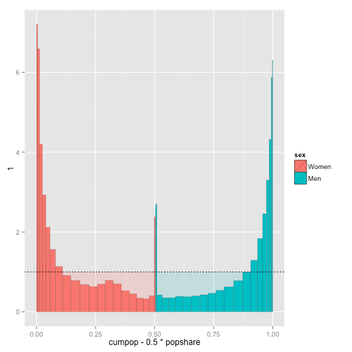
This really illustrates how a spie chart is constructed. The dotted line is the “break-even” point: below it, the expenditure of those groups is less than their share of the population, and above it those groups are consuming a share larger than their representation in the population. Note also that their are in fact two bar charts here, a pale one where all bars of of height 1 and a solid one over top.
To transform this into a spie chart we need to make two adjustments. The first is the conversion to polar coordinates (imagine taking each end of the x-axis and squeezing it to a point), and the second is to rescale the y-axis so that the area (and not the height) of the slices corresponds to the relative shares of the groups. Fortunately, this second step is also quite simple: it boils down to taking the square root of each y entry.
We can do this quite simply using ggplot:
spie <-
    bars +
    coord_polar(theta = "x") +
    scale_y_sqrt() +
    scale_x_continuous(labels = spie.data$bin,
                       breaks = spie.data$cumpop - 0.5 * spie.data$popshare) +
    labs(x = "Age Group and Sex",
         y = "Ratio of Expenditure to Population Size",
         fill = "Sex") +
    theme_bw() +
    theme(axis.text.x = element_text(angle = 0, size = 8))

print(spie)

And with the addition of the labels we’ve created a simple spie chart. Of course it is quite ugly — there are far too many labels for the groups — but this is the starting point.
Creating an “Information Visualization”
Moving away from a statistical graphic to a pretty infographic, or information visualization, requires some modifications to the plot. Traditionally, the advice was to export this from R and into Inkscape or some other drawing program in order to add annotations, nicer titles, and so on. But if you’re like me, and enjoy the idea of creating visualizations purely programmatically, then there are ways to accomplish this tidying up in R alone.
To start with, I’ve used the same approach as before as the base plot, but removed all of the axes and labels. This gives us a base object with which to build up the visualization:
library(grid) # For the units() function
library(ggplot2)

base <-
    ggplot(spie.data, aes(x = cumpop - 0.5 * popshare, y = r_exp, fill = sex)) +
    geom_bar(aes(width = popshare, y = 1),
             color = NA, stat = "identity", alpha = 0.2) +
    geom_bar(aes(width = popshare),
             color = "grey10", size = 0.1, stat = "identity") +
    annotate("segment", linetype = 3, size = 0.25, lineend = "round",
             x = -Inf, xend = Inf, y = sqrt(c(0.5, 1.0)),
             yend = sqrt(c(0.5, 1.0))) +
    coord_polar(theta = "x") +
    scale_x_continuous(labels = spie.data$bin,
                       breaks = spie.data$cumpop - 0.5 * spie.data$popshare) +
    scale_fill_brewer(palette = "Pastel1") +
    labs(x = NULL, y = NULL, title = NULL) +
    theme_bw() +
    theme(panel.grid = element_blank(),
          axis.title = element_blank(),
          axis.text = element_blank(),
          axis.ticks = element_blank(),
          legend.position = "none",
          panel.border = element_rect(colour = NA, fill = NA),
          plot.margin = unit(c(0, 0, -0.5, -0.5), units = "line"))

print(base)

Since I wanted to construct something of a narrative for this information, I
decided to annotate some of the interesting features of the plot. When using
ggplot2, the annotate function facilitates this. Unfortunately, because the
plot is in polar (square root) coordinates, this complicates placement. I just
tweaked values by eye instead of doing things systematically. This gives
final <- base +
    # Arrow to the 90+ group, and a text blurb:
    annotate("segment", linetype = 1, size = 0.25, x = 0.94, xend = 0.9925,
             y = sqrt(6.0) - 0.05, yend = sqrt(6.0),
             arrow = arrow(ends = "last", length = unit(0.3, "line"))) +
    annotate("text", size = 2, x = 0.935, y = sqrt(6.0) - 0.05,
             hjust = 1, vjust = 1,
             label = paste("If we take the ratio of the share of public health",
                           "spending to the share of the population for",
                           "five-year age groups, we spend at more",
                           "than 6:1 on those over 90.", sep = "\n")) +
    # Arrow to the 80-84 group, and a text blurb:
    annotate("segment", linetype = 1, size = 0.25, x = 0.03, xend = 0.095,
             y = sqrt(4.0), yend = sqrt(4.0),
             arrow = arrow(ends = "first", length = unit(0.3, "line"))) +
    annotate("text", size = 2, x = 0.1, y = sqrt(4.0), hjust = 0,
             label = "And more than 4:1 on those over 80.") +
    # Arrow to the 65-69 group, and a text blurb:
    annotate("segment", linetype = 1, size = 0.25, x = 0.855, xend = 0.93,
             y = sqrt(2.0), yend = sqrt(2.0) - 0.1,
             arrow = arrow(ends = "last", length = unit(0.3, "line"))) +
    annotate("text", size = 2, x = 0.85, y = sqrt(2.0), hjust = 1,
             label = "In fact by 65 the ratio is already 2:1.") +
    # Text blurbs:
    annotate("segment", linetype = 1, size = 0.25, x = 0.31, xend = 0.275,
             y = 1.05, yend = 1.5,
             arrow = arrow(ends = "first", length = unit(0.3, "line"))) +
    annotate("text", size = 2, x = 0.27, y = 1.16, hjust = 0, vjust = 0,
             label = paste("Only below age 55 is the ratio less than 1:1.",
                           "(The break-even point is illustrated by the",
                           "pale inner circle.)", sep = "\n")) +
    # Arrow to the inner circle and text blurb:
    annotate("segment", linetype = 1, size = 0.25, x = 0.65, xend = 0.62,
             y = 1.25, yend = sqrt(0.5) + 0.05,
             arrow = arrow(ends = "last", length = unit(0.3, "line"))) +
    annotate("text", size = 2, x = 0.7, y = 1.2, hjust = 1, vjust = 1,
             label = paste("In fact most of the remainder cost less than",
                           "50% of their share. (Women are more",
                           "expensive in their youth primarily",
                           "because of childbirth.)", sep = "\n")) +
    # Babies text and arrow:
    annotate("segment", linetype = 1, size = 0.25, x = 0.495, xend = 0.455,
             y = 1.53, yend = 1.83,
             arrow = arrow(ends = "first", length = unit(0.3, "line"))) +
    annotate("text", size = 2, x = 0.45, y = 1.8, hjust = 0, vjust = 1,
             label = "(Babies themselves are expensive, too.)") +
    # Explaining the graph itself:
    annotate("text", size = 2, x = 0.55, y = 2.2, hjust = 1, vjust = 1,
             fontface = "italic",
             label = paste("Age increases in five-year intervals as you move",
                           "up the graph, with the addition of 90+ and <1",
                           "groups at the top and bottom, respectively.",
                           sep = "\n")) +
    annotate("text", size = 2, x = 0.05, y = 3.0, hjust = 0, vjust = 1,
             fontface = "italic",
             label = "Women are in red, men are in purple.")

print(final)

The other obvious addition is to add a proper title and a caption on the bottom
of the image (containing, for example, sources and authorship). A good way of
doing this is with the arrangeGrob provided by the gridExtra package:
library(gridExtra)

out <- arrangeGrob(
    final,
    main = textGrob(
        paste("The Pressures of an Ageing Population:",
              "Public Health Spending in Canada"),
        hjust = 0, vjust = 1, x = unit(0.01, "npc"),
        gp = gpar(fontsize = 12, fontface = "bold")),
    sub = textGrob(
        x = unit(0.01, "npc"), y = unit(0.2, "npc"),
        hjust = 0, vjust = 0,
        gp = gpar(fontsize = 7, lineheight = 0.9),
        label = paste(
            "A. Jacobs :: unconj.ca\n",
            "Data: Canadian Institute for Health Information, 2013\n",
            "You may redistribute this graphic under the terms of ",
            "the CC-by-SA license.", sep = ""))
)

print(out)

Fonts
The nature of working with the PNG drivers when producing images is that you
are severely limited by the selection of fonts available. One clever way of
alleviating this is provided by the showtext and sysfonts packages, which
simply draw text objects as polygons and lines instead of text — and thus
avoid the font problem. I have not yet got showtext working with knitr,
so the following standalone code is used to produce the image at the top of
this post. Since the scaling is a little different, I’ve had to tweak the
final object slightly. I’ve also added a subtitle. It’s true that Minion
and Myriad are a little cliché, but they seemed like the most obvious choices
to start with.
require(sysfonts)
require(showtext)

font.add("myriad", regular = "MyriadPro-Regular.otf",
         bold = "MyriadPro-Bold.otf", italic = "MyriadPro-It.otf")
font.add("minion", regular = "MinionPro-Regular.otf",
         bold = "MinionPro-Bold.otf", italic = "MinionPro-It.otf")

final <- base +
    # Arrow to the 90+ group, and a text blurb:
    annotate("segment", linetype = 1, size = 0.25, x = 0.94, xend = 0.9925,
             y = sqrt(6.0) - 0.05, yend = sqrt(6.0),
             arrow = arrow(ends = "last", length = unit(0.3, "line"))) +
    annotate("text", size = 3, x = 0.935, y = sqrt(6.0) - 0.05,
             hjust = 1, vjust = 1, family = "minion",
             label = paste("If we take the ratio of the share of public health",
                           "spending to the share of the population for",
                           "five-year age groups, we spend at more",
                           "than 6:1 on those over 90.", sep = "\n")) +
    # Arrow to the 80-84 group, and a text blurb:
    annotate("segment", linetype = 1, size = 0.25, x = 0.03, xend = 0.095,
             y = sqrt(4.0), yend = sqrt(4.0),
             arrow = arrow(ends = "first", length = unit(0.3, "line"))) +
    annotate("text", size = 3, x = 0.1, y = sqrt(4.0), hjust = 0,
             family = "minion",
             label = "And more than 4:1 on those over 80.") +
    # Arrow to the 65-69 group, and a text blurb:
    annotate("segment", linetype = 1, size = 0.25, x = 0.855, xend = 0.93,
             y = sqrt(2.0), yend = sqrt(2.0) - 0.1,
             arrow = arrow(ends = "last", length = unit(0.3, "line"))) +
    annotate("text", size = 3, x = 0.85, y = sqrt(2.0), hjust = 1,
             family = "minion",
             label = "In fact by 65 the ratio is already 2:1.") +
    # Text blurbs:
    annotate("segment", linetype = 1, size = 0.25, x = 0.31, xend = 0.275,
             y = 1.05, yend = 1.5,
             arrow = arrow(ends = "first", length = unit(0.3, "line"))) +
    annotate("text", size = 3, x = 0.27, y = 1.16, hjust = 0, vjust = 0,
             family = "minion",
             label = paste("Only below age 55 is the ratio less than 1:1.",
                           "(The break-even point is illustrated by the",
                           "pale inner circle.)", sep = "\n")) +
    # Arrow to the inner circle and text blurb:
    annotate("segment", linetype = 1, size = 0.25, x = 0.65, xend = 0.62,
             y = 1.25, yend = sqrt(0.5) + 0.05,
             arrow = arrow(ends = "last", length = unit(0.3, "line"))) +
    annotate("text", size = 3, x = 0.7, y = 1.2, hjust = 1, vjust = 1,
             family = "minion",
             label = paste("In fact most of the remainder cost less than",
                           "50% of their share. (Women are more",
                           "expensive in their youth primarily",
                           "because of childbirth.)", sep = "\n")) +
    # Babies text and arrow:
    annotate("segment", linetype = 1, size = 0.25, x = 0.495, xend = 0.455,
             y = 1.53, yend = 1.83,
             arrow = arrow(ends = "first", length = unit(0.3, "line"))) +
    annotate("text", size = 3, x = 0.45, y = 1.8, hjust = 0, vjust = 1,
             family = "minion",
             label = "(Babies themselves are expensive, too.)") +
    # Explaining the graph itself:
    annotate("text", size = 3, x = 0.55, y = 2.2, hjust = 1, vjust = 1,
             family = "minion", lineheight = 0.95, fontface = "italic",
             label = paste("Age increases in five-year intervals as you move",
                           "up the graph, with the addition of 90+ and <1",
                           "groups at the top and bottom, respectively.",
                           sep = "\n")) +
    annotate("text", size = 3, x = 0.05, y = 3.0, hjust = 0, vjust = 1,
             family = "minion", lineheight = 0.95, fontface = "italic",
             label = "Women are in red, men are in purple.")

png("output5.png", width = 7 * 300, height = 7 * 300, res = 300)
showtext.begin()
out <- arrangeGrob(
    final + theme(text = element_text(family = "minion", size = 8)),
    main = textGrob(
        label = c(paste("The Pressures of an Ageing Population:",
                        "Public Health Spending in Canada"),
                  paste("The width of the slice corresponds to the population",
                        "size, and its area to the share of government health",
                        "spending devoted to that group.")),
        hjust = c(0, 0), vjust = c(1, 1), x = unit(c(0.01, 0.01), "npc"),
        y = unit(c(0, -2.1), "line"),
        gp = gpar(fontsize = c(15, 8), fontfamily = c("myriad", "minion"),
                  fontface = c("bold", "italic"), lineheight = 0.9)),
    sub = textGrob(
        x = unit(0.01, "npc"), y = unit(0.2, "npc"),
        hjust = 0, vjust = 0,
        gp = gpar(fontsize = 8, fontfamily = "minion", lineheight = 0.9),
        label = paste(
            "A. Jacobs :: unconj.ca\n",
            "Data: Canadian Institute for Health Information, 2013\n",
            "You may redistribute this graphic under the terms of ",
            "the CC-by-SA license.", sep = ""))
)
print(out)
showtext.end()
dev.off()